Clustering analysis of Dow Stocks
Overview
The Dow Jones Industrial Index (DJIA) is a widely followed stock market index of 30 publicly owned large companies based in the United States. Such companies are often categorised according to their business operations, but this is not necessarily reflected in the way their market valuations fluctuate. It is therefore interesting to analyse stock prices to identify companies that are trading in a similar way. This kind of clustering analysis is easily performed using R, which also provides excellent tools for manipulating and visualising the data, in particular with the ggplot2 package.
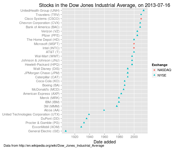
Companies in the Dow Industrial Average
Here is the list of companies in the DJIA and the date they were added to the index. The stock exchange ticker symbol is included in brackets after the company name. R allows the data shown here to be read in directly from the HTML table on the Wikipedia DJIA page, using the XML package.
DJIA daily stock prices for 2012
The share price data for these (and other) individual stocks can be downloaded from Yahoo Finance in comma-separated values (csv) format. Once again, the data can be downloaded directly from within R, using the ticker symbols provided in the table data shown above.
I have selected daily adjusted closing stock prices from 2012 for the analysis that follows. Note that UnitedHealth Group was only present in the Dow Industrial Average for part of 2012 (added on 24th September, 2012).
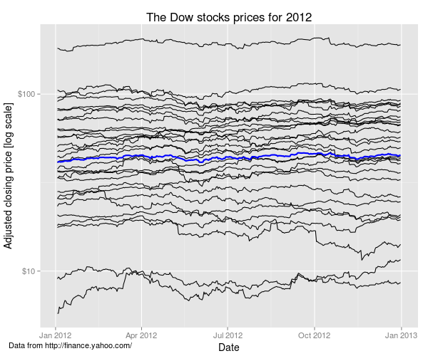
There is a wide range of prices for the individual shares (e.g. IBM stands out as being the most expensive), which makes it hard to compare the individual curves, even with the log y axis scaling used here.
One way to deal with this is to divide the price of each share by its mean value for the year, and use these scaled prices instead, as follows. The thick blue line is the (unweighted) mean for all the profiles.
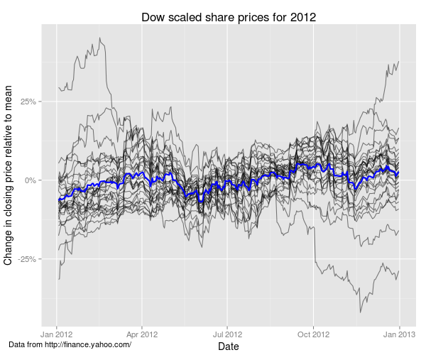
On average there was a mild uptrend for the year, but clearly there is a lot of variation about the mean curve. However, clustering analysis can be used to pick out stocks with similar patterns of variation, which can help to make sense of the overall pattern.
Clustering analysis of the Dow share prices for 2012
The similarity between different stocks can be determined by computing the correlation between all possible pairs of stock price time series. I have used the Kendall correlation coefficient, to increase the robustness to outlier data points in determining the (dis)similarity of the stocks.
The corresponding correlation matrix can then be subjected to a clustering analysis, to identify similar pairs of stocks. In this case I have used agglomerative hierarchical clustering, which is a bottom-up clustering algorithm.
Heatmap
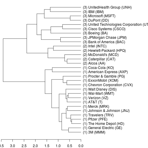
The correlation between the share prices of each of the 30 Dow stocks can be visualised as a heatmap in R, which also includes a hierarchical clustering dendrogram along each margin. The colour scale shows positive and negative correlations in yellow/green and blue, respectively 1.
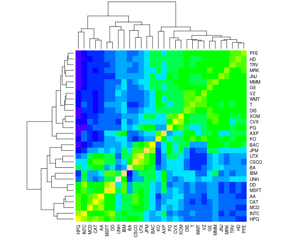
The dendrogram gives some idea of the similarity between the stocks: there are at least 2 or 3 clear groupings of stocks.
Most/least similar stocks
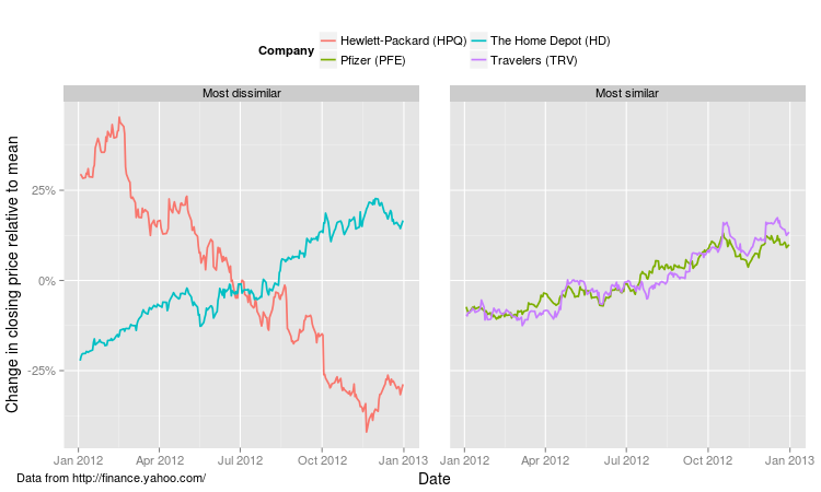
From the above correlation matrix, the two most similar stocks in the
Dow are Pfizer (PFE) and
Travelers (TRV), with a correlation of
0.78 and the two
most dissimilar stocks in the Dow are Hewlett-Packard (HPQ)
and The Home Depot (HD), with a correlation of
-0.74. You can clearly see
this behaviour in the relative closing price data for these stocks:
Clusters of similar stocks
As seen from the heatmap above, the proximity between different stocks in the Dow can be visualised as a dendrogram, which suggests there are three main clusters of stocks. Here the individual companies and ticker symbols in the dendrogram are labelled, and the cluster id (arbitrarily numbered 1, 2 or 3) is listed in brackets.
The stocks can then be plotted together within a separate panel for each of these 3 clusters:
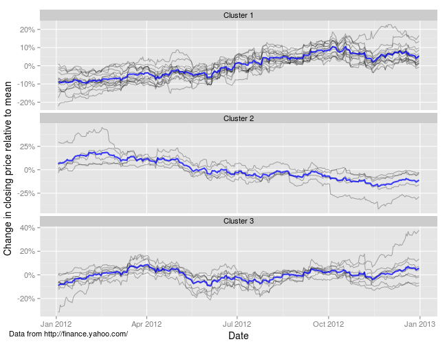
The stocks in cluster 1 show substantial gains over 2012, while those in cluster 3 are roughly flat over most of the year; cluster 2 comprises the under-performers, showing substantial losses on average for 2012.
Summary
Clustering analysis is a powerful technique to help make sense of data. It can detect patterns of similar types of object and identify unusual or anomalous cases. For example, clustering is often used in marketing strategies to identify groups of similar customers to target, or products to recommend.
About
This page is by Alastair Sanderson. You can see more demonstration data analysis projects using R at this page. You can contact me here.
The data used in this analysis are from:
Footnotes:
1 Colours along the diagonal are supposed to be yellow, corresponding to a correlation of 1 (i.e. a stock is identical to itself), but appear slightly varied to due some artefact of the colouring.