Ross-on-Wye weather data
Overview
The town of Ross-on-Wye hosts one of a number of Met Office weather stations located throughout the British Isles. The historical data go back quite far, with complete monthly measurements available from 1931 onward for a number of meteorological indicators. This makes for an interesting dataset to analyse and visualise and provides a nice demonstration of what can be accomplished using R, in particular with the ggplot2 package.
Analysing historic weather data for Ross-on-Wye
I have taken any provisional and estimated values (where present) at face value and included them with the normal measurements.
Monthly summary
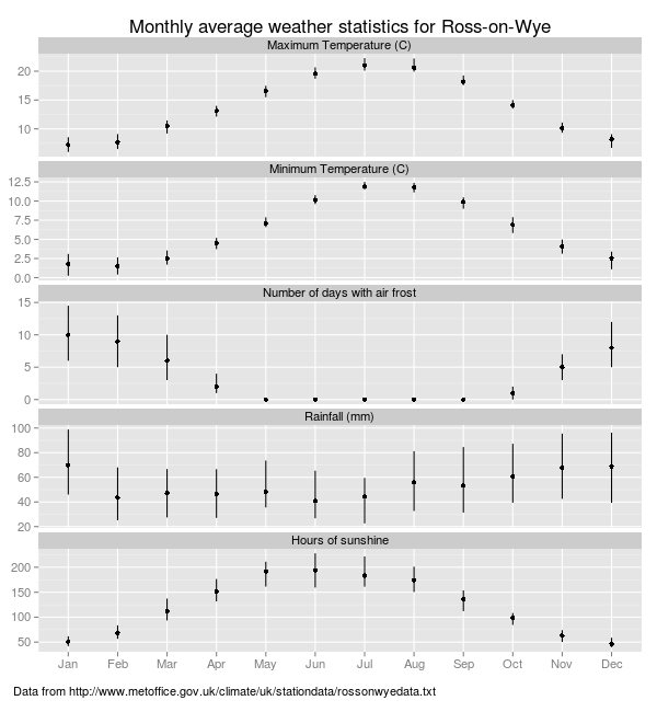
To begin with, here is a monthly summary of the Ross weather data
(1931 to
2013). Each point is the
median value, with the vertical error bar joining the 25th and 75th
percentiles; i.e. half the data points fall within this range.
Now let's look in some more detail at the range of variation in these measurements, month by month.
Hours of sunshine
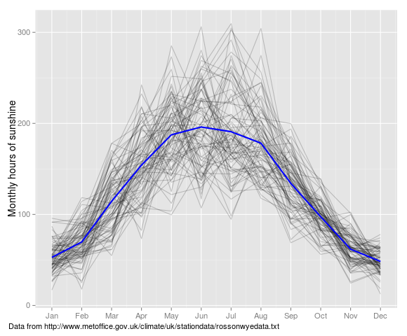
The following plot shows the number of hours of sunshine per month,
with a different line for each year and the mean for all years
(1931 to
2013) indicated as a solid
blue line. On average, there is almost 4 times as much sunshine in
summer than winter, but with a lot variation about the mean level.
Rainfall
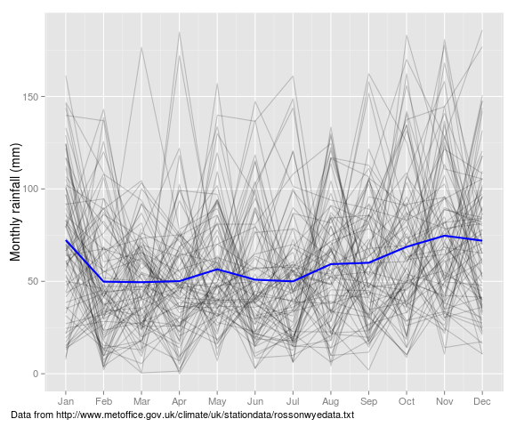
The monthly variation in rainfall in Ross can be seen in the following
graph, which shows a separate curve for each year, with the mean for
all years (1931 to
2013) in blue.
A more detailed view of the rainfall over the recent period
2001-2012 is shown
below, with a separate panel for each year. The dashed red line shows
the mean monthly rainfall for all the years
(1931 to
2013), for comparison.
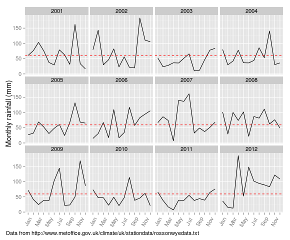
You can see that 2012 was a very wet year, despite the first 3 months being rather dry. This can be seen more clearly by looking at the annual rainfall totals.
Annual rainfall
The total rainfall for each year
(1931 to
2013) is shown as a dot
plot below. The years are ordered from highest to lowest rainfall, top
to bottom and the point colour indicates the year, with lighter blues
for more recent dates. The mean for all years is indicated by the
dashed red line.
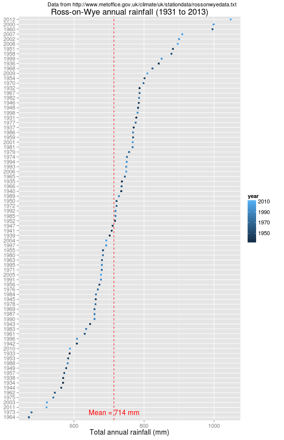
It is striking that the wettest year (2012) is preceded by the 3rd
driest year (2011), within the years recorded
(1931 to
2013).
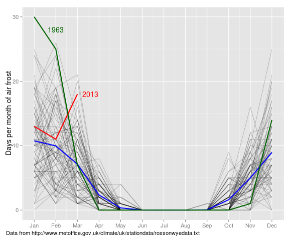
Days of air frost
The number of days of air frost each month is shown below, with
separate curves for each year and the mean for all years in blue
(1931 to
2013).
The red line shows the data for 2013, with the unusually cold March clearly standing out. Also shown is the line for 1963 (in dark green), which has the highest number of days with air frost in this dataset.
About
This page is by Alastair Sanderson. You can contact me here.
The dataset used in this analysis is available to download: http://www.metoffice.gov.uk/climate/uk/stationdata/rossonwyedata.txt